




In the West, pink has shifted from one extreme to the next over the last three centuries. Eighteenth-century fashion helped to popularize the shade, which was a favorite of the pastel-loving European bourgeoisie. Pink received a fuchsia facelift during the 1960s Pop Art movement and a neon-soaked ’90s revival, before settling down as the pale, “post-gender” center of every millennial moodboard. From Renaissance portraits to rose gold iPhones, here’s a brief history of pink in art—and beyond
A hard shade to pin down
Pink rarely appears in nature, which may explain why the color only entered the English language as a noun at the end of the 17th century. But in other languages, the shade remains difficult to pin down. “In Japan, at least seven different terms are used for pink shades,” says Bauhaus-Universität Weimar fine art professor Barbara Nemitz, co-author of Pink: The Exposed Color in Contemporary Art and Culture (2006).
Pink’s cultural significance can also vary widely between countries. In contemporary Japanese culture, says Nemitz, pink is perceived as a masculine and mournful color that represents “young warriors who fall in battle while in the full bloom of life.” In Germany, pink is “rosa”—a hue that’s “bright, soft, peaceful, sweet, and harmless,” she explains.
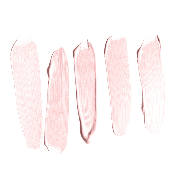
In 2004, Nemitz conducted a workshop in which she asked students from Tokyo to select a shade they felt encompassed the color “pink.” The swatches proved entirely different across cultures, with the Japanese participants favoring the cooler shades to the European penchant for warmer tones.
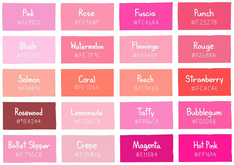
An ongoing exhibition at the Williams College Museum of Art (WCMA), “Pink Art,” serves to further highlight this subjectivity. Though anchored in the primary color red, pink isn’t part of the electromagnetic spectrum. “When we see pink, we’re not seeing actual wavelengths of pink light,” explains Christina Olsen, the outgoing director of the WCMA and curator of its current exhibition. “It’s an extra-spectral color, which means other colors must be mixed to generate it.” The diversity of pink hues is the result of adding or subtracting yellow and blue tones from a wide spectrum of colors.
So, even a computer can have a hard time identifying the shade. The works featured in “Pink Art” were selected by an algorithm that identified “pink” works from the museum’s collection. “The reality is, computer-based practices of curating turn out to be as distinctly subjective as human-based ones.”
The art history of pink
It wasn’t until the Renaissance that artists began to explicitly discuss pink as part of their palette. Italian painter Cennino Cennini described the shade as a blend between Venetian Red and St. John’s White, using it to provide the glowing undertones of religious figures and poised gentry alike. It wasn’t until the 1700s, however, that the color was popularized through the fashion and interior design worlds. Pastel pink was favored by both the men and women of the European bourgeoisie, from the Georgian gowns of Mary, Countess of Howe, to the embroidered silk coats sported by the well-heeled men of Louis XVI’s court. Praised by proto-psychologists of the late 18th century, pink was recommended as the bedroom color of choice for the business-minded gentleman for a restorative and uplifting home base.
The lush raucousness of the 18th-century movement was the perfect setting for pink’s rise to fame in the Western art-historical canon: sun-dappled dresses, enchanted forests, and saucy lovers’ whispers characterize the indulgent oil paintings of Jean-Honoré Fragonard from the 1770s. Over the next century, the color blossomed in popularity.
Under the umbrella of Japonisme, the 19th-century term for the influence of Japanese aesthetics and culture in the West, pink imbued the French Impressionist and Neo-Impressionist movement. From the sublime golden hours of Théo van Rysselberghe to Claude Monet’s lilies and Edgar Degas’s dancers, European pinks turned bold shades of musky rose, bright strawberry, and tropical cerise.
In the 20th century, pink’s cultural significance underwent a series of rapid overhauls. Its dramatic and exotic disposition was a perfect fit for one of the first modern movements, Fauvism. Post-World War I, pink slipped off the radar, hardly appearing in the male-dominated worlds of Surrealism, Dada, and Abstract Expressionism. By the 1960s, pink was flourishing again within the Pop Art movement. It found the perfect bedfellow in the movement’s melding of high art and mainstream culture, from Andy Warhol’s Marilyns to David Hockney’s bathers. It even tickled the palate of the more flashy minimalists, particularly the light art king Dan Flavin.
Then came the rise of digital aesthetics in the 1990s. “We discovered the mysteries of this former taboo color, its capacity to move us and frighten us,” says Nemitz. “It is thus a driving force in contemporary art.”
The politics of pink
“Pink has now become emancipated from the color of harmlessness, cuteness, sweetness, innocence, and the oppressed,” suggests Nemitz. “It has gained an active and powerful role.” She cites the color’s recent appearance in a number of activist demonstrations, from the pink-colored pussyhats of anti-Trump marches in the U.S. to the Gulabi Gang in India.
Yet pink has been equally at home lining the shelves. In 2005, the Korean photographer JeongMee Yoon documented her daughter surrounded by a sea of pink-hued purchases. She’s nearly swallowed whole by girly, plastic-y excess—a critique of the concentrated post-World War I effort to re-package pink as feminine, led by media giants and department superstores such as Time, Best & Co., Marshall Field, and Halle’s.
“How often do you see pink in architecture or machinery?” asks photographer and performance artist Signe Pierce. “How often is pink presented outside of a gendered perspective?” Her digitally manipulated photography saturates everyday scenes with a spectrum of pink, in response the color’s hyper-feminization beginning in the ’90s. “The insistence upon socializing women to identify with a color that doesn’t exist in the ‘real world’ is, to me, a testament towards the patriarchal hierarchies that work to keep women submissive in everyday life,” Pierce says.
The future of pink
In 2007, the avant-garde Swedish fashion label Acne Studios debuted its salmon-hued shopping bags; sensing a movement, Apple rolled out its first Rose Gold iPhone in late 2015. The same year, Drake and Pantone went head-to-head with “Hotline Bling” and “Rose Quartz,” which went on to top the charts in tunes and tones. As with Rococo, today’s so-called “millennial pink” positions itself as a gender-neutral color.
But is it succeeding? On one hand, millennial pink’s ubiquity reflects a growing rejection of the shade as a “secondary color for a second sex,” says Pierce. It speaks to a more emotionally connected and open culture, Nemitz notes, by “encouraging us to show ourselves as soft, sensitive and vulnerable.” It also trends towards the sublime, she continues: “Millennial pink is not worn out and dirty. The hue is unapproachable. It distances itself from everyday life.”
Yet millennials still cycle through a seemingly endless assortment of pale pink products, from coconut water to designer streetwear. Will this consumerism eventually consume pink? “I hope that in being dubbed ‘millennial,’” Piece says, “its usage will transcend a fleeting moment or trend and embrace its infinite place in time and space.”
