






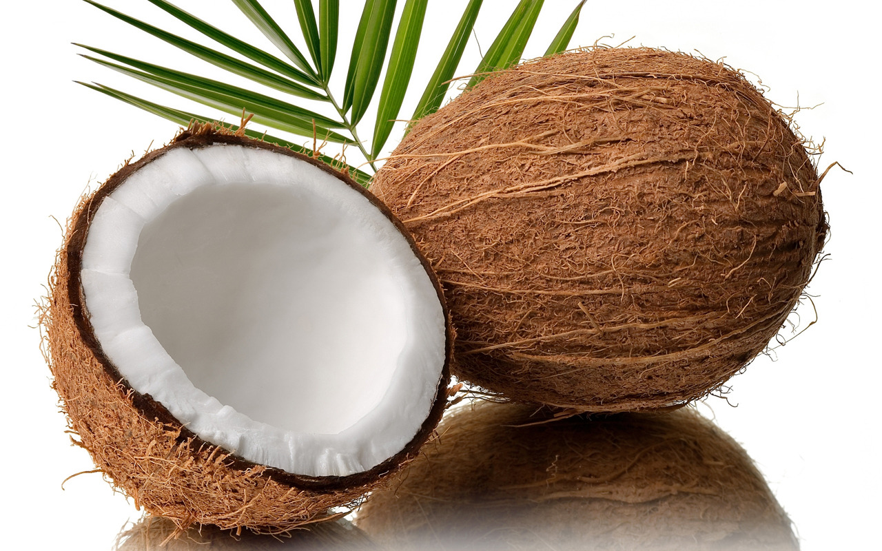
It’s All About BROWN
Despite its modern appeal, the origin of the word brown has been around since weaving was an exciting new technology. The color brown is a warm color that stimulates the appetite. and is just yummmmmmmy : ) It also represents the earth, earthiness and solid ground (literally!) steadfastness, simplicity, friendliness, dependability, and health. Brown affects the mind and body by creating feelings of wholesomeness, stability, and peace.
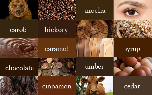
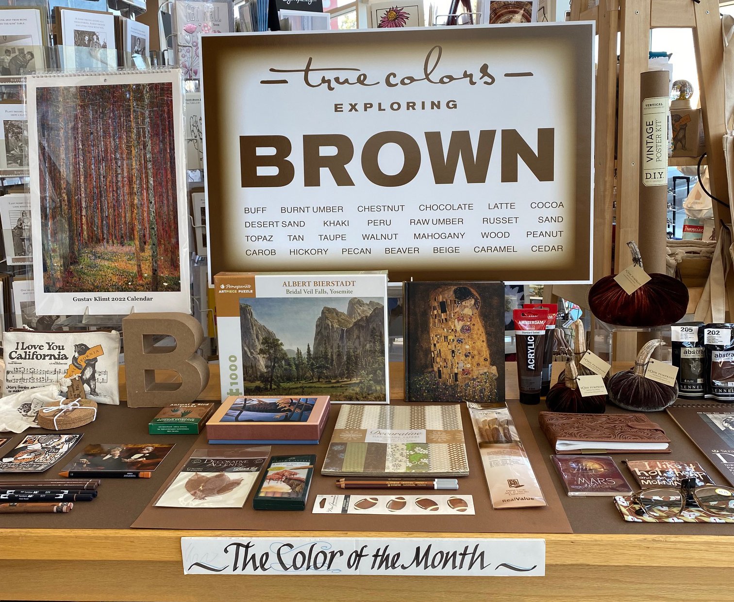
The word brown comes from Old English “brún,” used for any dusky or dark shade of color. While brown might be considered a bit dull compared to the other colors, it represents simplicity, health, and dependability. From khaki to umber, brown is a go-to neutral. UPS (United Parcel Service) long ago adopted brown as its corporate color with the slogan “What can BROWN do for you?” – and companies today often use brown paper to denote a natural product.
Although brown may not be as glamorous as other colors, its importance in painting is highly recognized by artists, who use browns such as burnt sienna and burnt umber to create subtle gradations from light to dark. The color brown therefore enables artists to create a sense of realism on the canvas.
A Short History of Brown Pigments
Humanity had pure brown pigments from the beginning of art. Umber is a natural earth color with many natural (raw umber, raw sienna) and manmade (burnt umber, burnt sienna) variations, providing painters throughout history with many brown shades to satisfy their visual needs. In the 17th century, another natural earth color came into use, namely Van Dyke brown.
Although earthy browns were available for artists’ use, in the 18th and 19th centuries European artists commonly used a brown called “mommia” that was made from corpses. Egyptian mummies were exhumed and processed for commercial use as artist paint.
Another odd source of the color brown was the cuttlefish, whose secretions of dark ink were used to create sepia dye. These days, artificial dyes have replaced cuttlefish ink for sepia.
Brown may cover a wide range of the visible spectrum because it refers to more hues (yellow, orange, or red) in combination with low luminance or saturation. Its shades are named using composite adjectives, such as red brown, yellowish brown, dark brown, and so forth. Browns can be made from primary colors, mixing blue with yellow to get green and then, mixing green with red. Browns can also be made simply by mixing orange or red color with a bit of black paint.
The White to Brown Revolution
Ground is the term describing the layer applied to the support as a preparation for painting. In early panel paintings, the ground consisted of inert white filler (chalk or gesso (mineral gypsum)) bound with animal skin glue.
In the early 16th century, artists began to color their grounds dark brown because doing so made it possible to execute a painting more rapidly and freely. Dark brown grounds were also exploited in the composition of a painting, either by leaving parts exposed, as can be seen in the detail of the shaded part along the forehead and nose, where the brown ground is partly visible. The evolution was complete by the 17th century, when it became unusual to paint onto a white surface.
Rembrandt used carbon black as the main tinting pigment for the ground layer. In this cross-section from the top part of the white sash of the man on the extreme left of the painting, we can see from bottom to top the brown colored chalk and glue ground followed by a bit brighter second thin ground. Next, another dark mixture was used for the under painting and finally the lead white layer of the sash.
Brown and orange are more closely related than you might have imagined. The perceived color depends upon which white a color is compared with. This is particularly true for tertiary colors like brown, which is perceived only in the presence of a brighter color contrast; otherwise it looks orange. Orange is still perceived as such, regardless of the general illumination level. Look at these two disks in the image. They are objectively identical, but the one in a brighter light looks brown, while the one in the shadow looks orange. The indefinable nature of brown could be the reason why Japanese do not have a specific word for it but refer to brown with names such as “tea-color” and “fallen-leaf.”
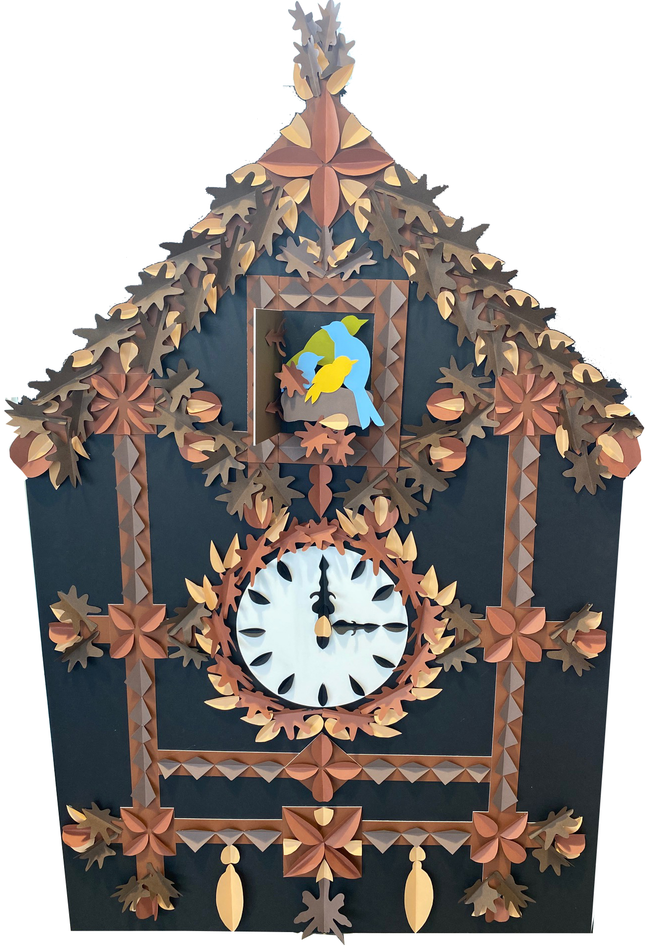
The paper clock below is on display at UArt Redwood City!
